Samofund · 10th Annual Trip · Hong Kong 2025
Samofund
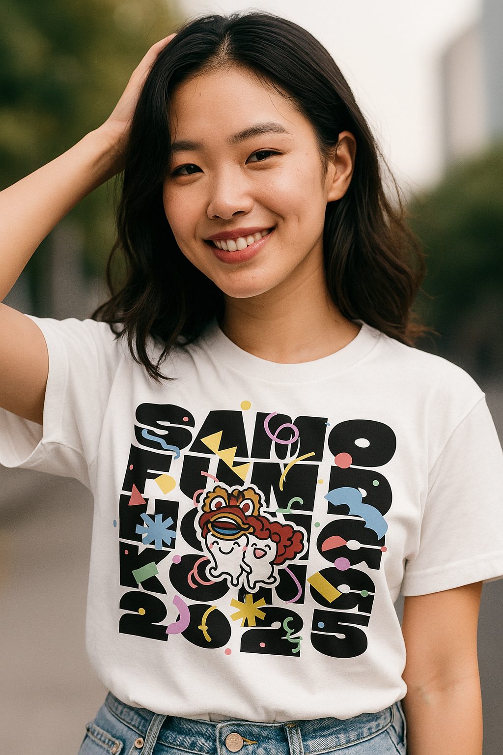
A shirt design concept for a decade of travelling together — fat stacked lettering, a cast of Hong Kong characters, one anniversary worth wearing home.
The brief, in one line
Ten years of Samofund trips deserved more than a logo on a chest. The tenth — Hong Kong — needed a shirt people keep wearing after the flight home: loud enough to be a souvenir, composed enough to read as design.
The answer
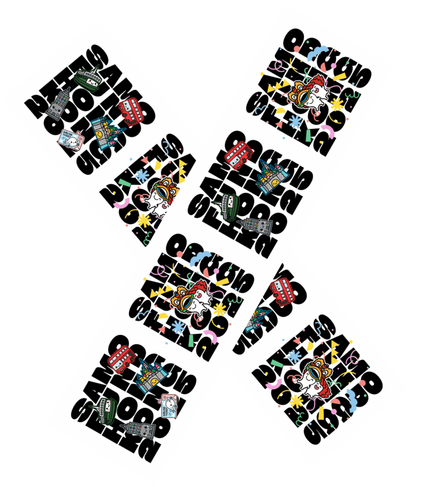
A five-line lettering block — SAMO / FUND / HONG / KONG / 2025 — set heavy and edge-to-edge, then broken open so a ferry, a double-decker, a castle, a panda and a lion dance can sit inside the counters of the type.
- Client
- Samofund
- Occasion
- 10th annual trip
- City
- Hong Kong
- Garment
- White cotton tee
- Front + nape
- Role
- Concept → artwork
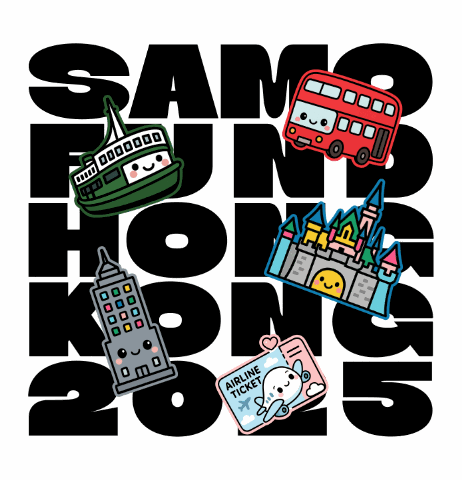
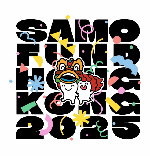
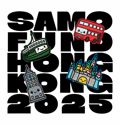
Five words, five lines, no leading to spare. Each line is redrawn to justify the full width, so the block reads as one solid slab from across a hotel lobby — and the characters get to interrupt it rather than decorate around it.
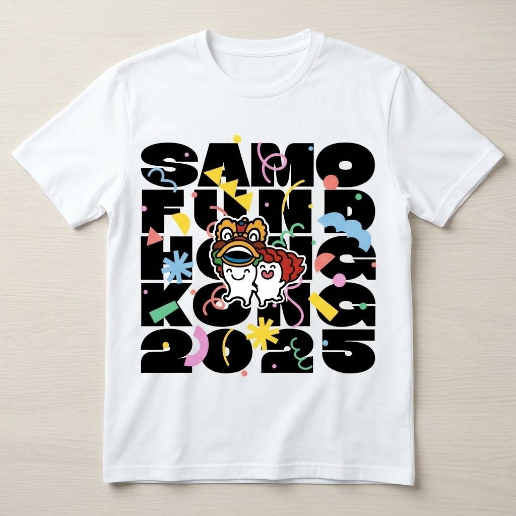
Front print sits high and wide — chest-filling at every size, because the block scales while the characters hold their drawn weight.
The back carries the same five lines shrunk to a nape stamp in soft grey: a quiet signature rather than a second billboard.
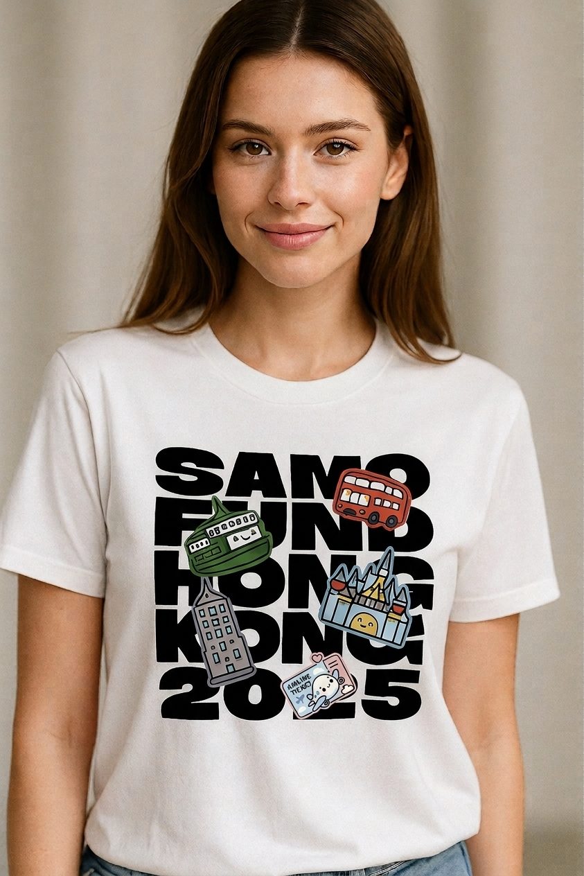
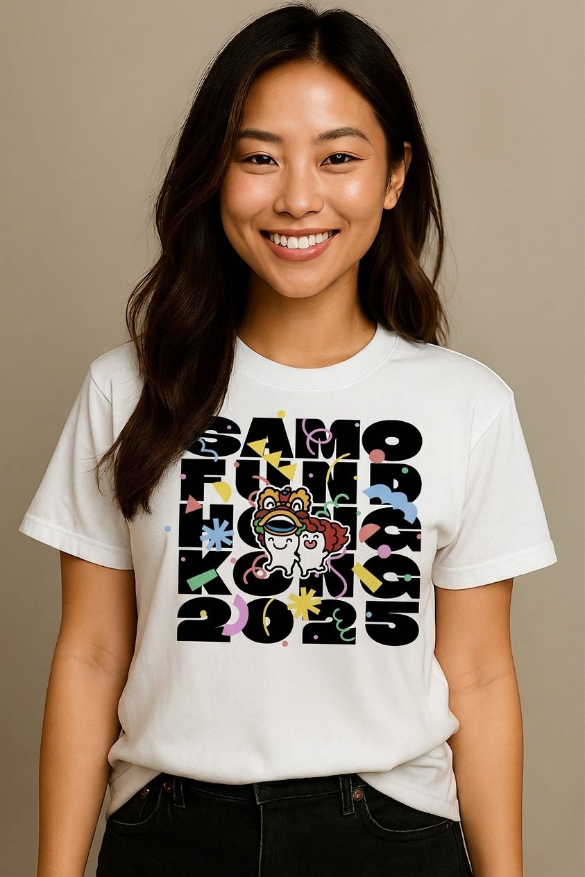
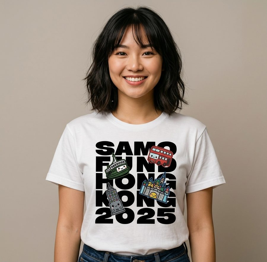
One print, forty-odd people, nobody asking which size looks best.
Next case, yours
Hire me as your visual artist
Company trips, anniversaries, merch drops, event identities — give me a milestone and I’ll give it something people want to keep wearing.